*These lessons are not designed to memorize tips and tricks but to help you understand topics and concepts. The goal is to help you become an independent trader who thinks for themselves and one who applies trading principles mentioned here.*
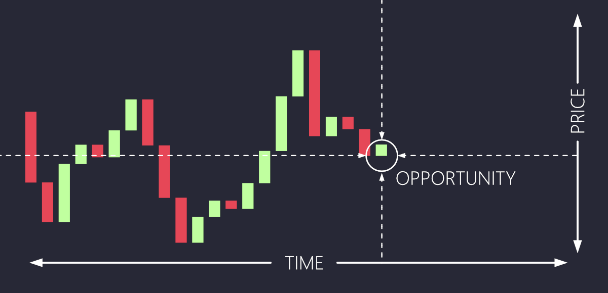
2.0 Time, Price, and Opportunity: Part Two
In trading, time, price, and opportunity are deeply intertwined. Just as winter clothes may be heavily discounted in spring because they are out of season, assets in the financial markets can also be overvalued or undervalued based on timing and market conditions. When an asset is undervalued, it is like those discounted winter clothes—there is an opportunity to buy at a lower price with the potential for future gain. Conversely, when an asset is overvalued, it is akin to paying a premium for items that are in high demand and seasonally relevant.
Timing is crucial in trading because it dictates when opportunities arise. A savvy trader, much like a bargain hunter, knows to look for signs that indicate when an asset is trading below its intrinsic value, signaling a buying opportunity. Similarly, recognizing when an asset is trading above its intrinsic value can signal a good time to sell.
The key is to understand the market cycles and sentiment, much like understanding seasonality in retail. By doing so, traders can position themselves to take advantage of undervaluation by buying low and capitalize on overvaluation by selling high. This strategic approach helps in making informed decisions that align with market dynamics, thereby maximizing potential returns.
Summary
Think of the TPO formula like shopping for clothes during a sale. Time is knowing when the right season hits—like buying winter coats at the end of winter when prices are dropping. Price is the specific item you're interested in, maybe a high-quality jacket that’s now marked down. Opportunity is making sure you’re getting a great deal—buying the jacket at a discount, so you’re maximizing your savings compared to the full price. It’s about timing your purchase, focusing on the right item, and ensuring the deal is worth it!
2.2 Price, charts...action!
Price action in trading refers to the movement of a financial instrument's price over time. It focuses on patterns, trends, and key levels, such as support and resistance, derived directly from price charts. Traders use price action to understand market sentiment and forecast future movements based on historical behavior.
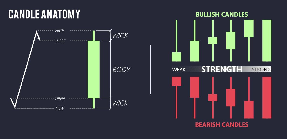
Given the vast amount of data to analyze, traders often prefer using candlestick charts to condense information into manageable time chunks. Each candlestick represents four key data points: the open, high, low, and close prices for a specific period. This format not only summarizes the data efficiently for the given timeframe but also enables traders to identify and interpret developing patterns in real-time. By observing these patterns, traders can spot potential market opportunities, making candlestick charts an invaluable tool for effective price action analysis.
2.4 Candles
A candlestick chart is a visual representation of price movement over a specific time period, with each candle showing four key points: the open, high, low, and close. The body of the candle reflects the price range between the open and the close, while the wicks (or shadows) above and below show the highest and lowest prices reached during the period. A green (or white) candle indicates the price closed higher than it opened, showing bullish momentum, while a red (or black) candle means the price closed lower, signaling bearish sentiment. Candlestick charts are useful in identifying market trends, reversals, and key price levels.
2.6 Top down Analysis
Top-down analysis is a method used in day trading to asses the market by starting with the broader picture and narrowing down to specific setups. It involves analyzing larger timeframes, such as the daily chart to identify the overall market trends, key levels and market structure before zooming into smaller timeframes, like the 15-minute or 5-minute charts, for precise entries and exits.
This approach is crucial because it ensures trades align with the broader market context, reducing the risk of trading against the dominant trend. It also helps traders identify key areas of support, resistance, and potential reversals, improving the probability of success. Every little bit helps and increases our edge.
to perform top-down analysis, start by examining the overall trend and key levels on higher timeframes. Identify major swing high, lows, and potential breakout zones. Then, move to smaller timeframes to look for patterns, price action signals, and setups that fit the broader market narrative. This layered approach allows traders to make more informed and confident decisions.
A 20 cent move hardly makes headlines! so we start by investigating at biggest time frame, the daily chart!
2.8 The Bouncy Ball: Support and resistance
Imagine you're bouncing a ball inside a room. The floor keeps the ball from going any lower, and the ceiling stops it from going any higher. In trading, support is like the floor—it's the price level where the stock tends to stop falling because lots of people want to buy it. Resistance is like the ceiling—it’s the price where the stock stops going higher because many people want to sell it. Traders use these levels to help them decide when to buy or sell, just like you know the ball will bounce between the floor and the ceiling!

2.10 Candle Spotting
When trading support and resistance, it’s important to identify the right candlestick patterns around these key areas. Look for weak candles as the price approaches support or resistance, indicating hesitation or indecision among buyers or sellers. These can be small-bodied candles, like "Dojis" or spinning tops, signaling potential exhaustion. On the bounce or reversal, watch for strong candles with larger bodies and decisive movement, such as bullish or bearish engulfing patterns, which confirm the market's shift in momentum. This combination helps to spot whether price is likely to respect or break through the levels.
We look for weakening candles as the price approaches support, followed by strong candles bouncing off that level, and the same applies for resistance. A classic example of this is the bearish engulfing pattern: near resistance, a small, weak candle forms, indicating indecision or slowing momentum. The next candle then strongly rejects this level, forming a larger, more powerful candle to the downside, signaling a potential reversal. This shift from weak to strong candles helps confirm the market’s direction near key support or resistance zones.
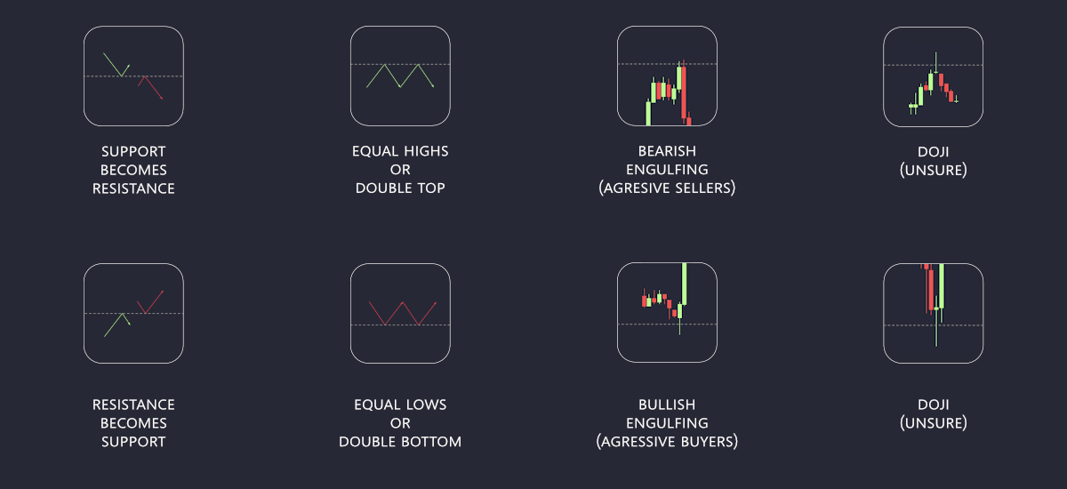
Although support and resistance are commonly represented as single lines, they are better understood as zones or areas, since price movements are rarely exact. A support zone doesn't guarantee that price will bounce immediately, and the same is true for resistance. The significance of these areas depends on their position within the broader market structure. Traders must assess whether price is likely to respect or break through these zones, helping them decide where to place trades based on the strength of these levels as part of their risk assessment program.

TPO formula for trading support and resistance strategies:
Time: Identify key support and resistance in a larger time frame by observing where the price has historically bounced or reversed. Wait for price to approach one of these levels, signaling a potential entry point.
Price: Watch for price action as it reaches the support or resistance zone. If price test the level and shows signs of rejection (like wicks or specific candlestick patterns), this can indicate the level will hold, confirming the strength of the level
Opportunity: the opportunity lies in buying near support or selling near resistance. For support, place a stop-loss just below the support level in case of a breakout. For resistance, place a stop-loss just above the resistance level. The Goal is to capture price movements as the market reverses off these key levels while keeping risk controlled and clearly defined.

2.12 Area of interest: Part one
An area of interest is a specific price level where traders wait for price action to reach before deciding to take action. These areas can be identified through two methods: those driven by market structure, such as support and resistance levels, price swings, or reversals, and those created by trading tools like Fibonacci retracements or moving averages. These zones serve as critical points where market behavior becomes more predictable, providing traders with opportunities to confirm their bias and evaluate signals to enter or exit trades. By focusing on areas of interest that fit their strategy and risk tolerance, traders can align their decisions with a structured and methodical approach to the market.
Areas of interest are tied to the type of trade. There are three types of trades:
Break-out
A breakout occurs when price "breaks-out" of the range and forms a new trend.
Continuation
A continuation is when price reaches a new high or low, takes a short break in a form of consolidation then "continues" in the direction of the trend.
Reversal
A reversal is defined in Fibonacci terms whenever price returns to the swing low after reaching a new swing high. In Fibonacci, price returns to the 0 level.

2.14 Nifty-Fifty
Another form of support and resistance emerges in the form of the midline, often referred to as the 50% line. This level represents the average price of a swing, calculated by finding the midpoint between the swing high and swing low. Price frequently retraces to this level as part of a natural process of market rebalancing, where buyers and sellers temporarily reach equilibrium. This rebalancing makes the midline a critical area for traders, as price often pauses or reverses here during its movement.
The midline also plays a key role in understanding premium and discount levels. When the price is above the midline, it is considered at a premium, or relatively expensive, suggesting it may face resistance as sellers step in. Conversely, when the price is below the midline, it is seen as being at a discount, or undervalued, often attracting buyers. This concept helps traders frame their decisions around the likelihood of price moving back toward the midline or continuing in its current direction.
2.16 Fibonacci
Fibonacci Retracement: The step back!
Imagine you're climbing up a hill, but halfway through, you stop to catch your breath and take a small step back before continuing upward. Fibonacci retracement in trading is similar—it helps us figure out how far a stock’s price might pull back, or step backward, before moving forward again.
Traders use Fibonacci retracement levels to estimate how much a price might drop during a pause in an uptrend. These levels are based on special Fibonacci numbers, and they help us see where the price might bounce back and continue moving in the same direction. It’s like knowing when the stock is just taking a break before climbing again!
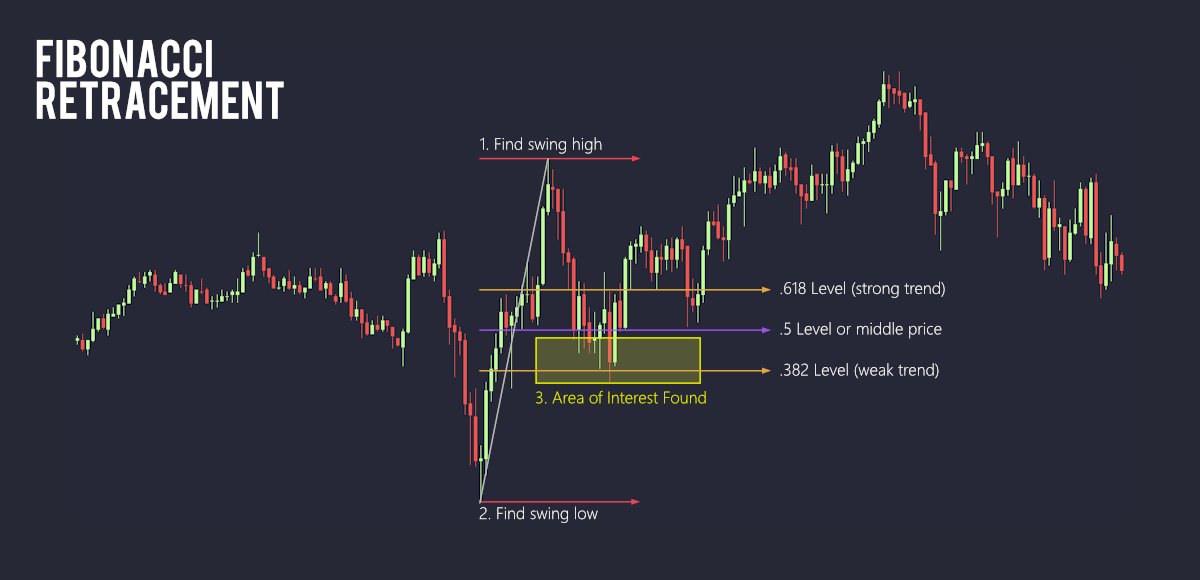
A Fibonacci retracement will often have a variance of levels dependent on the strength of the the trend
Fibonacci Extension: The extra mile!
Imagine you’re running a race, and you reach the finish line. But now, instead of stopping, you keep running even farther to see how far you can go. In trading, Fibonacci extension is like that—it helps us figure out how far a stock’s price might keep moving beyond its usual "finish line."
We use special numbers, called Fibonacci numbers, to predict these extensions. Traders use these numbers to estimate how much higher (or lower) a price might go after a big move. It’s like guessing where the stock might "run" next, so we know when to take action, like buying or selling!

Charting software automatically populates Fibonacci levels
Price (Area of Interest) refers to the specific area of interest, like whether the price is approaching key levels (support, resistance, Fibonacci retracements, etc.) from above or below. It’s about identifying where the price currently is in relation to these critical levels.
🙌 congrats you have completed the concept of price! 🙌
3.0 The coin toss game: intro to profitability
Imagine you have a coin with two sides: heads and tails. When you flip the coin, there are only two possible outcomes; it can either land on heads or tails. Each time you flip, there's a chance, or probability, of getting heads or tails—50% for each side. In this case, the probability of heads or tails is the same, but in other games or situations, the chances might be different!
Remember: "In coin toss games, as the number of tosses increases, the outcome approaches a 50/50 split, in line with theoretical probabilities."
The coin toss is a simple game with only 2 possible outcomes: head or tails. The chance of the coin landing on either side is equal—1 out of 2, or 50%. Trading shares a similar concept, there are two potential outcomes: upside or downside, bullish or bearish.
Consider the following example:
If you earn $10 when the coin lands on heads (a win) and lose $10 when the coin lands on tails (a loss) over 20 coin flips, what would your gross profit be?
$10 for heads and -$10 for tails over 20 coin flips:
($10 x 10 heads) - ($10 x 10 tails ) = Gross profit
$100 from wins - $100 from losses = $0 profit
In this case, you break even, with no profit and possibly even a loss if flips skew.
$100 from wins - $100 from losses = $0 profit
In this case, you break even, with no profit and possibly even a loss if flips skew.
Let's change the rules a little bit.
$20 for a win and -$10 for a loss over 20 trades:
($20 x 10 wins) - ($10 x 10 losses) = Gross profit
$200 from wins - $100 from losses = $100 profit
$200 from wins - $100 from losses = $100 profit
Here, you've turned a profit!
In this scenario, playing the coin toss game involves risking $10 for a potential reward of $20, resulting in a risk/reward ratio of 1:2. In trading, this principle is crucial—you should aim to participate only when the potential reward significantly outweighs the risk. Identifying opportunities with a minimum 1:2 risk/reward ratio is fundamental to consistent profitability.
In gambling, however, the odds are stacked against the player, and outcomes rely more on luck than informed decisions. Engaging in activities where the risk greatly outweighs the reward can lead to financial losses and addictive behavior, making it an unwise application of this principle.

Here we have the accounts of 6 day traders who follow the 1:2 risk-to-reward ratio and just so happen to have a win rate of around 50%. Shown are 100 of their trades.
With a 50% hit rate and a risk/reward ratio of 1:2, the statistical probability of becoming profitable is in your favor. This means that for every losing trade, you risk $1, but for every winning trade, you gain $2. Even if you only win half of your trades, the profits from your winning trades will outweigh the losses from the losing ones. Over time, this consistent approach creates a positive expectancy, leading to profitability despite a hit rate of just 50%.
Notice, when we emulated this strategy over the first 20 trades, hardly anyone made significant profits. This highlights that while the math is on your side, real-world outcomes require patience and consistency. Profitability builds over time, and big gains may not appear immediately, but the strategy sets a strong foundation for long-term success.
Opportunity (Risk) refers to ensuring there is a favorable risk-to-reward ratio, meaning that the potential reward is significantly greater than the risk involved in the trade. It helps ensure profitability over the long run.
🙌 congrats you have completed the concept of opportunity! 🙌
Putting all together!

Above is the 30-minute chart for SPY. Initially, the market structure shows an uptrend, with higher highs and higher lows. However, it later transitions into equal highs and equal lows, indicating that the price is ranging.
The overall market structure reflects a ranging phase, where caution is needed, as breakouts may signal the start of a distribution stage, potentially followed by a declining phase.
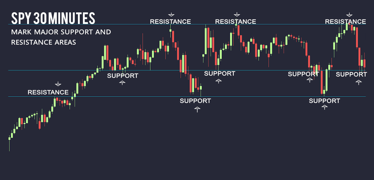
From left to right, we annotate the first level a resistance turned into support. Then we annotate resistance where we notice the price rejection at the common price area. Notice the candles near resistance (dojis, spinning tops) signs of rejection and weakness.

After identifying our support and resistance areas, we locate the swing high and swing low of the range to establish the mid-price line. This mid-price line is particularly interesting because it acts like a magnet, often drawing the price back to it throughout its movement. In a range-bound market, the area above the mid-line can be considered "premium," meaning the price is relatively expensive, while the area below the mid-line is seen as "discount," indicating the price is at a lower, more attractive level for buyers.


Now, we move to a smaller timeframe to get a more detailed view of the current price action. We observe that the price has formed an equal low at a major support level, then traveled to the top of the range, making a higher high just above another support area but still below the mid-price line (in the discount zone). Given that the price has recently made a higher high after forming an equal low, we anticipate that the next move could be another higher high following a retracement. This retracement presents a potential opportunity for traders, provided it aligns with our risk profile and target objectives.

Finally we get our entry at the Area of interest (yellow box) inside the Fibonacci retracement. Price crosses goal 2 (our profit goal) and into goal 3 (resistance and overall price goal) notice the last candle (rejection of the resistance area)
# The Trading Assets
To make sound trades, we focus on highly liquid instruments. Market liquidity refers to how easily you can buy or sell assets like stocks. With plenty of buyers and sellers, trades happen quickly and at fair prices. Poor liquidity, however, means fewer participants, leading to slower trades and larger price changes, often resulting in less favorable prices.
The most popular and liquid trading instruments are the indices and the Magnificent Seven. Naturally, we’ll begin by exploring these key financial instruments to begin trading.
SPY (S&P 500 ETF)
SPY tracks the performance of the S&P 500 index, which consists of 500 of the largest U.S. companies. Since it represents a broad and diversified basket of well-established companies, its volatility is relatively low.
Volatility Rating: Low
QQQ (Nasdaq-100 ETF)
QQQ tracks the Nasdaq-100 index, consisting mostly of large technology companies like Apple, Amazon, and Microsoft. While it's more focused on tech and growth sectors, it has moderate volatility due to the strength and size of its components.
Volatility Rating: Moderate
IWM (Russell 2000 ETF)
IWM tracks the Russell 2000 index, which is made up of small-cap U.S. companies. These smaller companies tend to be more sensitive to market fluctuations, economic changes, and investor sentiment, making IWM more volatile than both SPY and QQQ.
Volatility Rating: High
An ETF, or Exchange-Traded Fund, is like a big basket that holds many different things, like stocks or bonds.
# The Magnificent Seven
The magnificent Seven stocks are a group of high-performing and influential companies in the U.S. Stock market.
Microsoft (MSFT)
Microsoft is a global tech giant known for its software, cloud services, and enterprise solutions. With its stable revenue streams, it has relatively low volatility compared to the S&P 500.
Volatility Rating: Low
Apple (AAPL)
Apple is a leading consumer electronics company, famous for its iPhones, MacBooks, and services like iCloud. Its massive market share and steady growth make it less volatile than many other tech stocks.
Volatility Rating: Low to Moderate
Alphabet (GOOGL)
Alphabet, Google's parent company, dominates the online advertising market and is a leader in search and AI technologies. Though it faces some market fluctuations, it remains relatively stable compared to other high-growth stocks.
Volatility Rating: Moderate
Amazon (AMZN)
Amazon is the world's largest online retailer and cloud services provider. Its stock can be more volatile due to the company’s heavy investment in growth and the e-commerce sector's sensitivity to economic changes.
Volatility Rating: Moderate to High
Meta (META)
Meta, formerly Facebook, is a social media giant with a strong presence in digital advertising. With shifts in user trends and significant investments in virtual reality, its stock can experience more swings than the broader market.
Volatility Rating: High
NVIDIA (NVDA)
NVIDIA is a leader in graphics processing units (GPUs) and AI technology. The stock is more volatile due to its strong growth in cutting-edge sectors like AI, where market sentiment can change rapidly.
Volatility Rating: High
Tesla (TSLA)
Tesla is a company that manufactures electric vehicles and clean energy. Its stock is known for significant price swings due to innovation, investor speculation, and the market reaction to CEO Elon Musk's action.
Volatility Rating: Very High
X.II Market Terminology
Ask Price: the minimum amount sellers are willing to receive for a share or contract. When buying at market price, you pay this amount.
Bid price: the maximum amount buyers are willing to pay for a share or contract. When selling at market price, you receive this amount.
Spread: the spread is the difference between the ask and bid price. A wider spread suggests poor liquidity as buyers and sellers are not agreeing on a fair price or the middle ground.
Volume: volume is the number of units bought and sold in a given period.
Volatility: volatility means how much the prices of things go up and down. If prices change a lot quickly, the market is very "bouncy" or volatile. If prices stay mostly the same, the market is calm or less volatile.

"Buy the ask, Sell the Bid!"
TTRD Lesson 2 | Part TWO
You have learned support and resistance, Fibonacci, Great! but why does this keep happening?

Exact values for support and resistance is very rare and it doesn't happen often.
Does it look familiar?
The trader sees a range with resistance above and support forming Equal Lows (EQL), the trader takes this as a signal to go long. They enter near the previous low with a stop-loss placed below support. However, price drops, hits the stop-loss, and closes the trade at a loss—only to reverse and move higher as initially anticipated.
This phenomenon is commonly referred to as a fake-out in trading, though traders use various terms to describe it, such as liquidity grab, liquidity pool, resting liquidity, stop hunt, or market making. Regardless of the terminology, the reality is that this event occurs frequently and is a key part of how the market functions. At these levels, price often moves to trigger stop-loss orders or capture liquidity before reversing, creating opportunities for institutional players and savvy traders to capitalize on the volatility. Understanding this behavior is essential for navigating the market and avoiding being caught on the wrong side of the move.

Resting Liquidity
Resting liquidity refers to orders placed in the market that haven’t been executed yet, such as buy orders below current price levels or sell orders above. These areas act as magnets for price movement, as the market often gravitates toward zones with significant resting liquidity. Once price reaches these areas, it typically triggers the orders, causing a spike in volume. After tapping into this liquidity, the price often retraces, as short-term traders take profits or react to the influx of orders, leading to a temporary reversal or consolidation.
So why does price reach higher highs?
So why does price reach higher highs?
TPO: Review
Time
Are you trading at the right time?
Are you trading with bias that relates to current market structure?
Are you trading with most liquidity available?
Is the market structure clearly defined? time to be bullish or bearish?
Price
Are you waiting for price to reach your area of interest with discipline?
Are you taking action only when price is in your area of interest?
Has price reached an actionable area?
Opportunity
Does the risk validate the reward? or is this trade worth the risk?
Is the reward at least twice of the risk?
How clear is the set up before me?
Have I seen a set up identical to this before?


